SUBSCRIBE NOW
Join the Newsletter!
Entrepreneurship
Client Love
Marketing
Web Design
Email Marketing
Brand Design
Categories
Let's Connect
more about me
I help creative entrepreneurs and service providers create beautiful and effective strategic brands, websites, and email marketing programs.
owner + designer
I'm Tammy Hooker
Ciao!
The Woodlands at Stowe | Brand Design
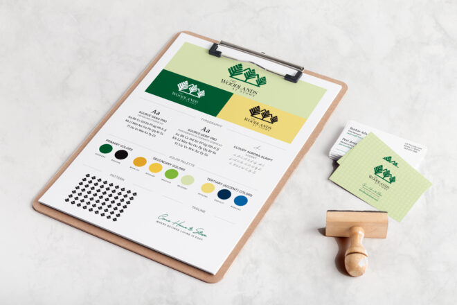
Before becoming The Woodlands at Stowe, they were Copley Woodlands, an active 55+ independent living retirement community in the heart of Stowe, Vermont. And for 25 years, they’ve been dedicated to their belief that everyone should be able to live with dignity and independence in a setting where they can be close to the activities they enjoy and live without the burdens of traditional homeownership.
But when they received a new name, The Woodlands needed a new brand and logo design to match. And having been a client for several months, they turned to ZiaStoria to oversee their rebranding.
The Story of The Woodlands at Stowe
Opened in 1998, The Woodlands is a 40-unit independent living community that offers condominium-style homeownership with a convenient monthly service fee that includes an active community lifestyle and activities, chef-prepared meals, building and property maintenance, and basic utilities.
Initially, The Woodlands was a joint partnership between Copley Health Systems, Inc. (Copley) in Morrisville, Vt. and the University of Vermont Medical Center in Burlington, Vt. But in 2021, Copley obtained sole ownership of the community.
Not long after, discussions began on dropping Copley from the business name to give the community its own identity and an opportunity to reach a larger audience. And so, in 2023, Copley Woodlands was reborn as The Woodlands at Stowe.
The Challenge of Creating a New Identity Without Losing Historic Connections
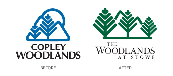
The biggest challenge going into this project was separating The Woodlands’ identity from Copley’s. Over its’ 25-year history, The Woodlands branding has always remained tightly bound to the hospital’s – same colors, fonts, and even logomark, though the number of trees in The Woodlands’ logomark has seen several iterations over the years. But in essence, the two brands have always been carbon copies of one another.
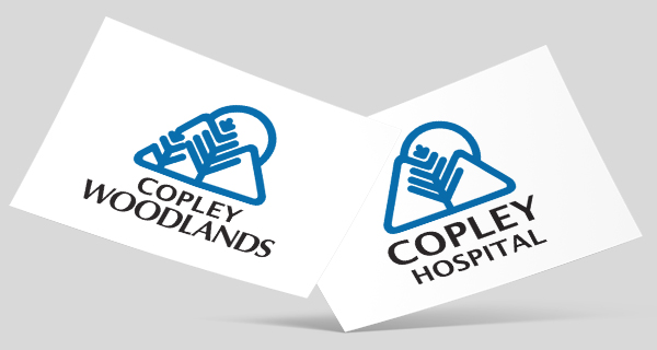
On top of that, the community’s existing branding and marketing material designs haven’t stood the test of time.
“We knew we were behind in our marketing on many fronts, and the initial discussions were ‘how do we get there from here,’ shares Ruthie Adams, site manager at The Woodlands. “It was a daunting project, but we took it one stage at a time with the goal of creating a brand-new marketing strategy and look and feel.”
The goal now was to give The Woodlands its own personality, one that set it apart from, yet still connected it to, the Copley Hospital brand.
How ZiaStoria Rebranded The Woodlands
Because The Woodlands has 25 years of history to draw upon, that’s where I turned to first for inspiration—starting with the logomark.
Modifying The Woodlands’ Logomark
Pretty early on, we decided to refresh the existing logomark instead of starting from scratch. In doing so, The Woodlands could preserve some of the community recognition it had earned over the years while also maintaining a tie back to the Copley Health Systems brand.
To do this, I looked at iterations of the logo that The Woodlands had used throughout its history. While the hospital logo utilizes a single tree against a pair of mountain peaks and a setting sun, The Woodlands used the same image but with two or sometimes three trees in their logomark.
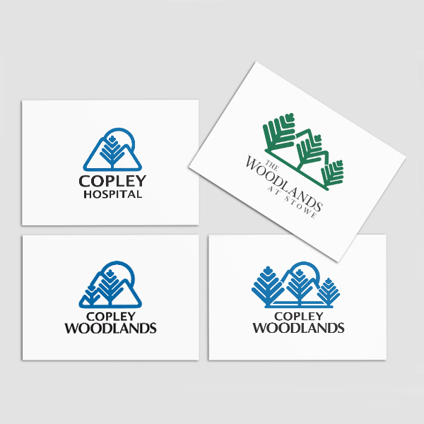
For The Woodlands’ new look, we chose to use the three-tree version as our jumping-off point. But I simplified the overall design for a cleaner, more modern feel.
Updating and Modernizing Typography
The original typography for The Woodlands’ logo was thick and heavy. Again, pulled directly from the Copley branding. In redesigning it, I chose a lighter, more feminine look.
The new logo typography is a hybrid serif display typeface that’s elegant and stately for a classic appearance that speaks to The Woodlands’ 25-year history. Yet it’s also expressive with thick and thin stroke lines and a wavy crossbar that adds movement, mirroring the community’s active lifestyle.
And knowing that The Woodlands’ audience is older, I paired the logo font with a versatile, modern sans serif and serif font collection designed for a pleasant, easy reading experience in both print and digital applications.
Lastly, I updated the existing tagline to incorporate a relaxing, whimsical handwritten typeface for a casual touch, a look reminiscent of a handwritten letter from an old friend.
Discovering a New Color Palette
Perhaps the biggest change to The Woodlands’ branding is its use of color.
The Woodlands at Stowe is an appropriate name for this independent living community, as it’s nestled among a forest of evergreen and colorful deciduous trees. But the original color palette didn’t reflect this natural environment. If anything, it spoke more to their hospital-based parent company’s cool, sterile environment.
In developing their new color palette, I mined Copley Health Systems’ brand style guide and discovered that while the hospital system focused on the traditional use of blue for its marketing, their approved color palette included shades of greens and gold. Colors that perfectly reflected The Woodlands’ personality.
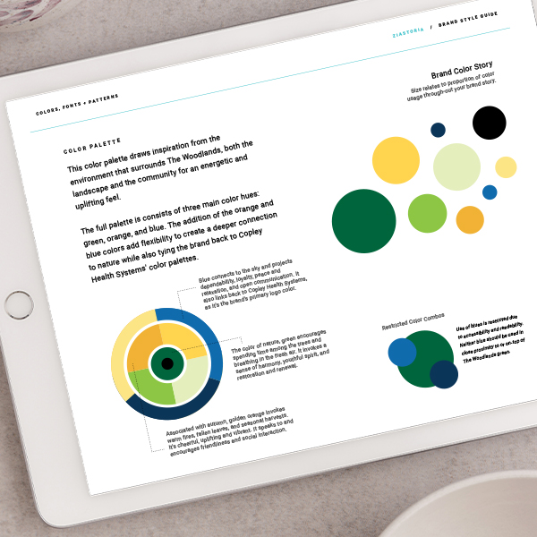
What emerged was a new color palette focused on three earthy colors: green, gold, and blue.
- The color of nature, green encourages spending time among the trees and breathing in the fresh air. It invokes a sense of harmony, youthful spirit, and restoration and renewal.
- Associated with autumn, gold invokes warm fires, fallen leaves, and seasonal harvests. It’s cheerful, uplifting, and vibrant. It speaks to and encourages friendliness and social interaction.
- Blue connects to the sky and projects dependability, loyalty, peace, relaxation, and open communication. It also links back to Copley Health Systems, as it’s their primary brand color, though for The Woodlands, this color has become a limited-use accent color.
Not only does this new palette speak to the environment surrounding The Woodlands’ property. It better reflects the community, which is active, friendly, and welcoming, and the people who call it home.
The End Result
By leaning into Copley Health Systems’ lesser-used brand colors and modifying the logomark just enough so it can stand on its own, The Woodlands has gained a look that modernizes the brand, speaks more to the environment the community is rooted in and is vibrant – just like the residents who live there.
Take a closer look at The Woodlands’ new branding. View their project in my portfolio.
“Tammy understood what we were striving for and has created something to be very proud of,” shares Ruthie. “Our updated look is clean and approachable, two things that I wanted to make sure we kept at the forefront. We have achieved that, and I couldn’t be more pleased.”
With a new brand and logo design, updated print materials, a new website, and a new marketing plan, The Woodlands is ready to welcome new residents into their community for 25 more years and beyond.
Does the branding and website for your business need a refresh to capitalize on a new opportunity or a milestone in your business like The Woodlands? If so, let’s chat!
let's do this!
let's build your brand a personality your customers will love!
Ready to infuse your brand with personality?
© 2025 | ZIASTORIA LLC | ALL RIGHTS RESERVED
est. 2021
contact
resources
blog
client portal
portfolio
about
Sign Up
Get my best tips, tricks, and how-tos delivered right to your inbox.
Join My Newsletter
ZiaStoria partners with creative entrepreneurs and service providers to craft brand designs, websites, and email marketing programs focused on connecting with customers and growing businesses.
Beautiful & Effective Brands
Email Marketing
Brand + Web Design
Brand Design
What can I help you with?