SUBSCRIBE NOW
Join the Newsletter!
Entrepreneurship
Client Love
Marketing
Web Design
Email Marketing
Brand Design
Categories
Let's Connect
more about me
I help creative entrepreneurs and service providers create beautiful and effective strategic brands, websites, and email marketing programs.
owner + designer
I'm Tammy Hooker
Ciao!
Lisa A. Olech | Brand & Showit Website Design + Email Marketing

When Lisa came to ZiaStoria, she’d published ten contemporary and historical romance novels, become an Amazon Best Seller, and a Romance Writers of America RITA Award nominee. And as she’d been connecting numerous couples within the pages of her novels, she’d also brought dozens of happy couples together in real life as a justice of the peace.
But between books eight and nine, her publishing career underwent a substantial shift – she transitioned to a hybrid-publishing model. And while taking the reins as a self-published author was an exciting new journey, unfortunately, it meant receiving less marketing support from a traditional publisher.
But she was OK with that.
Since the release of her first novel, Lisa has designed, built, and managed her website on her own. And while it hasn’t been perfect, it’s done the job.
Only now, she needed it to work harder for her. But her old branding and website were missing key functionality and vital selling information. More importantly, they didn’t reflect Lisa’s warm personality.
“I knew it was time for a new website design. And I wanted and needed to expand my marketing reach,” shares Lisa. “But when I looked at my old website, I felt frustrated and overwhelmed. And I lacked the time and confidence to tackle the enormity of a redesign on my own.”
Now, after working with ZiaStoria to create a custom brand and Showit website, Lisa feels confident to embark on the next chapter of her career with a brand that captures who she truly is.
Lisa’s Challenge: Branding a Website for Multiple Businesses
If you were to ask Lisa what business she’s in, she’d tell you it’s love. But, ask her what she actually sells… that’s where things get tricky.
See, Lisa has two distinct business offerings. First and foremost, she sells products featuring the love stories of multi-faceted, adventurous, smoldering fictional characters. The second is a service that honors real-life love stories through marriage.
This made challenge #1 of Lisa’s new brand and website design to present her writing and wedding services as one cohesive brand. One that accurately represented Lisa’s personality.
Enter challenge #2 – finding and conveying Lisa’s true essence to her readers and clients.
“Wherever I am, I try to add a little bit more light, beauty, and love to the world,” says Lisa. “But the design of my old website wasn’t helping me do that.”
Far from it, actually. Lisa was a newly published author when she originally DIYed her website (out of necessity, like so many other solopreneurs). She was still finding and defining her author brand space. Now with ten books under her belt, she knows exactly who she is as an author and how her readers see her.
And that is not dark, moody, and unengaging – which is how her old website presented her. On the contrary, Lisa’s warm and friendly—a free spirit who’s a little bit spunky and always ready to share a heart-warming or laugh-worthy story.
With her transition to a hybrid publishing model, she can infuse her marketing with this new perspective on herself and her brand.
How ZiaStoria Found Lisa Olech’s Brand Personality
Full disclosure: I’ve known Lisa as a friend and author for years. I adore her stories and characters, especially her pirates. I was honored to take on this project for her. But even that didn’t stop fear from niggling its way into her decision-making process when choosing a design partner.
“Lack of funds had pushed me to do things for myself for so long that my biggest fear was that I wouldn’t find someone who took my input into consideration,” shares Lisa. “But there are only so many hours in the day. So I knew I needed help if I was going to broaden my marketing scope. And Tammy was the right person for the job. She’s brilliant, meticulous, and leaves nothing to chance.”
Our history aside, I approached Lisa’s project like another client’s. By starting with a deep dive examination of her business’ core to find the very heartbeat of her brand.
Brand Design
Branding is an integral part of marketing. It touches every corner of your business – from your logo to the colors you use and the words you speak. It’s about defining a personality. The exact challenge Lisa faced, especially as she needed to speak to two distinct audiences – romance readers and couples looking for a wedding officiant.
This made the brand design phase of Lisa’s project vital. Without this, she’d end up with just another pretty website – beautiful to look at but ineffective for her bottom line.
Understanding what made her brand unique required us to thoroughly explore what had brought her to this point and where she saw her brand going moving forward. And after examining her current visual identity, her brand values and goals, her target audiences, and her competitors— not to mention taking stock of her past marketing initiatives—we developed a strategy to guide her new brand design.
Design Strategy
A great brand design doesn’t start with the creation of a logo. Instead, it begins with developing a strategy that identifies the key components that make up your brand—elements a designer will use to guide the creation of the perfect visual identity.
A design strategy offers the foundation to craft your brand personality. It identifies everything from key brand characteristics to color palettes, fonts, imagery, and patterns that should ground your brand’s identity.
In Lisa’s case, it helped us identify her brand’s new focus, aesthetic, and, most importantly, her new brand personality. In doing so, we address both of her initial challenges.
Here’s what Lisa’s new design strategy identified:
- Focus: Featured around stories of love through integrated yet separate services, with 90% of the brand focused on her writing career and 10% on her wedding services.
- Aesthetic: The overall approach must be classic yet elegant, with a clean and fresh vibe that’s light and fun but also professional.
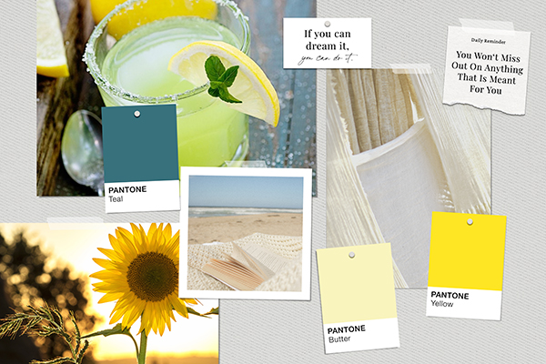
- Personality: Lisa’s warm and friendly, open and free-spirited—a friend you could sit on a beach with, margarita in hand, and share stories with for hours.
Lisa’s New Brand Design
Expressing Lisa’s design strategy characteristics visually in a mood board, her brand is like a margarita on a sun-kissed beach. Fresh, fun, and light. A beverage that speaks to someone who loves connecting with people and celebrating life but is also warm like a ray of sunshine and isn’t afraid to be herself.

And guided by this new aesthetic, a new typography story developed. A handwritten script paired with a contemporary yet classic typeface that’s approachable and professional for a fresh, fun, and light brand story. A combination that transformed her existing classic, standard stock fonts into a classic contemporary mix.
It’s a font story that evokes a transitional vibe that mixes classic lines with a modern sensibility.
The final result is a brand design that’s warm and welcoming, approachable and professional, just like Lisa. And her new logo can easily accommodate either side of her business with a simple text swap, maintaining brand consistency across both services.
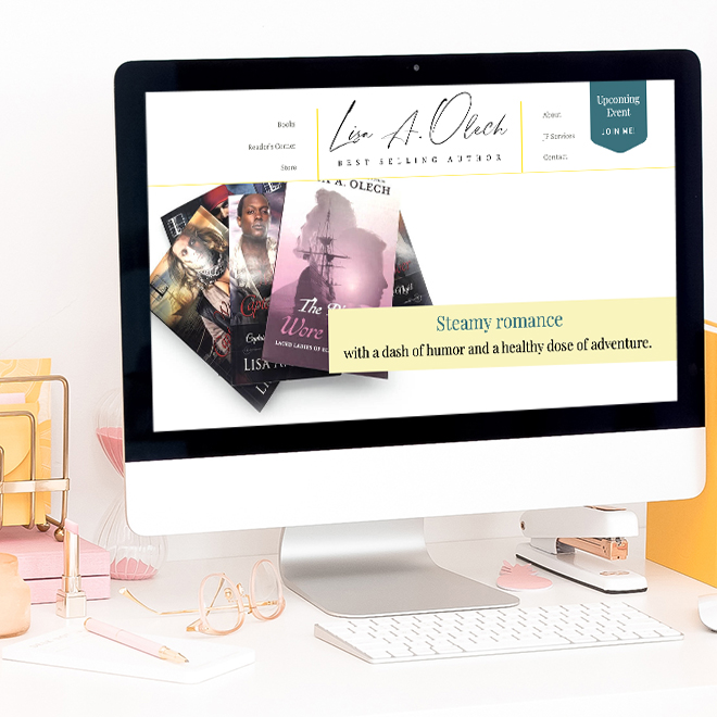
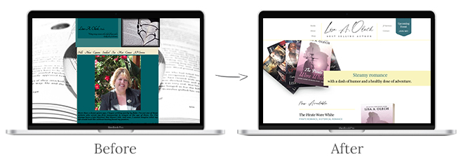
But the most significant change has come to her website itself. What had been cold and uninviting, with a dark but limited color palette, has transformed into an energized and welcoming environment that draws visitors in.

Take a closer look at Lisa’s new branding. View her project in my portfolio.
The Measurable Impact on Website Performance
We ran Lisa’s website through HubSpot’s Website Grader before and after launching her new Showit website. And the immediate results were impressive. The sitewide grade increased by 55%, and overall performance increased by 17%. Meaning Lisa’s site is running faster and cleaner, which helps increase traffic and improve usability (which leads to better conversions).
Revised and expanded content on her book series pages now offer everything readers need to know about Lisa’s books – from book titles, cover art, back cover copy, and customer reviews to quick links for readers to purchase her books from their favorite online retailers. With more information available on-site, Lisa can keep visitors on her website longer. And it’s working! Pre-launch, her visitors hung around for just under 1-minute. Now they’re spending nearly 2.5 minutes!
Designed with a 1-page website mentality, the new justice of the peace services page visually integrates with the author side of the site and includes everything a couple needs to book a wedding–from service offerings to past client testimonials and how to book a call.
From an infrastructure standpoint, Lisa’s new site improved by 100% in one key area: mobile-friendliness.
Mobile-friendly websites are a must in today’s world. Yet Lisa’s old website hadn’t been optimized for mobile, which meant 51% of her website traffic had a not-so-stellar brand experience. Thanks to Showit’s ability to design for desktop and mobile separately, Lisa now has a custom-designed mobile version so her visitors can have outstanding no matter how they reach her website.
But the biggest change has come from Lisa herself.
“I love the result! I loved her fresh ideas and that little gasp I made when I saw the finished product,” shares Lisa. “Tammy held my hand throughout the whole process, taking me from overwhelmed to confident that I can take my writing career to the next level.”
Lisa now has a solid foundation, including a fully-strategized and integrated email marketing program, to continue building her career on. But what excites me and makes me most proud is her newfound positivity and faith in her ability to move forward.
Does the branding and website for your business need a refresh to capitalize on a new opportunity or a shift in your business model like Lisa’s did? If so, let’s chat!
let's do this!
let's build your brand a personality your customers will love!
Ready to infuse your brand with personality?
© 2025 | ZIASTORIA LLC | ALL RIGHTS RESERVED
est. 2021
contact
resources
blog
client portal
portfolio
about
Sign Up
Get my best tips, tricks, and how-tos delivered right to your inbox.
Join My Newsletter
ZiaStoria partners with creative entrepreneurs and service providers to craft brand designs, websites, and email marketing programs focused on connecting with customers and growing businesses.
Beautiful & Effective Brands
Email Marketing
Brand + Web Design
Brand Design
What can I help you with?