SUBSCRIBE NOW
Join the Newsletter!
Entrepreneurship
Client Love
Marketing
Web Design
Email Marketing
Brand Design
Categories
Let's Connect
more about me
I help creative entrepreneurs and service providers create beautiful and effective strategic brands, websites, and email marketing programs.
owner + designer
I'm Tammy Hooker
Ciao!
How to Create a Brand Color Palette
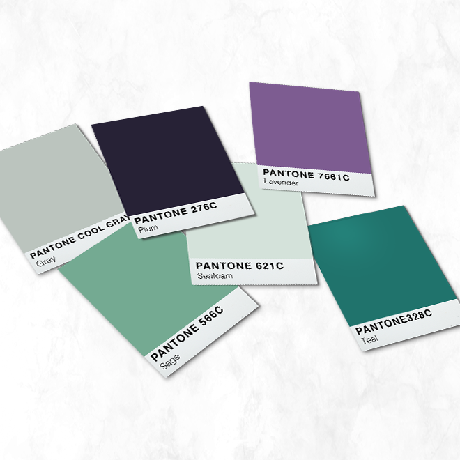
Color plays a crucial role in branding. And an established brand color palette can benefit you and your customers in three ways.
Firstly, color can help establish your brand’s visual personality, which can help your ideal audience connect with you.
Because color can instantly convey emotions and meaning, it can express your beliefs and values in a heartbeat. In fact, color can make up 90% of a consumer’s initial impression (Review42), and research has confirmed that 60% of the time, consumers will decide if they’re attracted to a message based solely on color (ColorMatters).
Second, consistent use of color can create cohesiveness across your brand—from your website to your social media, your packaging, and more—which helps to build trust and loyalty. Creating a brand color palette makes it easy to ensure you’re using the same colors no matter where your customers may come across your brand.
Think of McDonald’s golden arches. If you saw their classic “M” logo in, say, purple, you’d immediately know something was wrong because purple isn’t part of their brand color palette. This one moment of pause could trigger a lost sale because your audience feels what they’re looking at isn’t trustworthy.
This all leads to my final point…
A consistent color palette makes you more easily recognizable. Consistent color can increase brand recognition by up to 80% (ColorMatters), and recognition makes it easier for your customers to spot you and tell you apart from your competition.
In fact, 59% of consumers will spend their money on a brand they’re familiar with over one that’s new to them. Consider Coca-Cola, the most recognized brand in the world. If you go into a store looking for a soda and see a red Coca-Cola bottle next to a bunch of other non-familiar brands, if you like Coke, then you’ll grab that Coke over something else more than half of the time.
So, how do you create a brand color palette? Let’s walk through the process and some key points you should keep in mind.
Define Your Visual Direction
Determining your visual direction is the best place to start in developing a brand’s look. This process has three steps: defining your target audience, identifying brand adjectives, and creating a mood board.
Target Audience
Every marketing project begins with first understanding who your audience is. In understanding your target audience (your ideal customer or a buyer persona), you’ll know how to connect with them to address their challenges and pain points. Or, more specifically, how YOU can help them overcome those challenges.
But how does this relate to the visual design of your brand?
Color can convey emotions and meaning, which we’ll talk about shortly. Knowing your audience means understanding what emotions drive them and, by extension, what colors they might respond to. If someone is looking for comfort and reassurance, they aren’t going to connect with a vibrant, bold color like fire engine red.
Ideal customer information can be gathered by surveying your current customer base or conducting some online research. When all else fails, look inward. If your product or service is something you yourself would use, start by surveying yourself, as at that moment, you are your ideal customer.
The type of information you’re looking for includes both demographic (statistical) and psychographic (personality-related) information.
Demographic details include gender, age, education level, profession, income level, family status, location, understanding where they get their information, and the best way for you to connect with them (social media channels, email, in-person, etc.).
Psychographic details include their primary goals or needs (wants and aspirations), key frustrations and fears, beliefs, attitudes and values, hobbies and interests, and what drives their purchasing decisions.
Brand Adjectives
The first step in defining your brand’s visual direction is to identify adjectives that describe the tone and characteristics of your brand. In short, these are words that describe the vibe your brand should give off. Moving forward, they’ll act as guideposts for any aesthetic design choices you make.
Mood Board
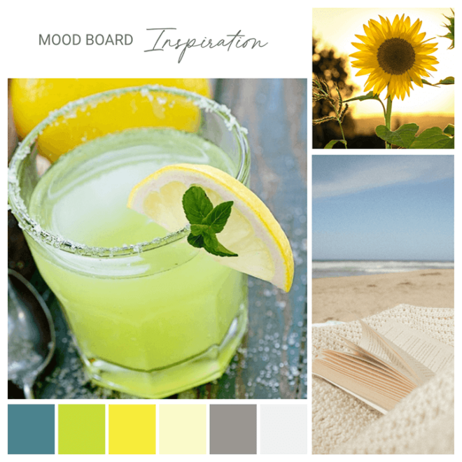
A mood board is a collection of images, colors, textures, patterns, and possibly even fonts that express the mood you envision for your brand. While nothing in a mood board is set in stone, it acts as a tool to focus your thoughts and offer guidance on the visual direction you’d like to explore for your brand.
In the rebranding for author and justice of the peace Lisa A. Olech, I started with the words that most associated with her brand—warm, friendly, open, and free-spirited. When contemplating these keywords, I pictured a friend with whom you could sit on the beach, margarita in hand, and share stories for hours. This translated to a warm, sun-kissed color palette inspired by the cocktail, the beach, and the sun.
Build a Color Hierarchy
A well-rounded color experience includes three categories of color: primary colors, secondary colors, and accent colors. How you utilize the colors in these categories creates a color hierarchy, or color story, that helps you establish where and how often to use each color.
Primary Color
Your primary color is the color you’ll use 85% of the time. It can appear in your logo, website, social media, marketing emails, packaging, store design, signage, and more. Anywhere you can express your brand in color, your primary color is your go-to color.
Secondary Color
A secondary color works in tandem with your primary color in logos. It can be an additional color or an alternate color option for your logo, a background color on your website or in packaging, an accent in marketing materials, used on signage, and so much more. A secondary color is used 10% of the time.
Accent Color
Lastly, there’s your accent color, which has a usage rate of around 5%. This color is used for key moments, like call-outs, buttons, and background colors.
Selecting Colors
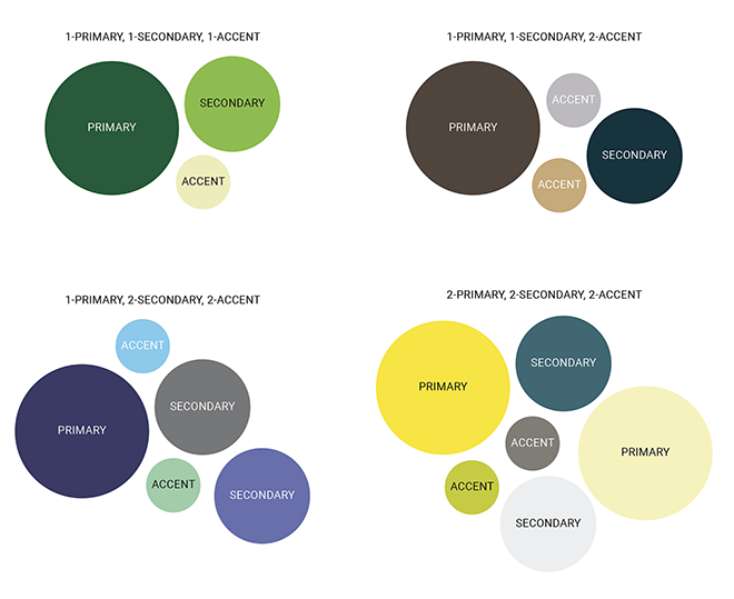
An ideal brand color palette consists of 3-6 colors: 1-2 primary colors, 1-2 secondary colors, and 1-2 accent colors. Any more than six, and your palette can become a bit cumbersome to use and implement consistently.
If your brand is looking for a more minimalistic feel, that should also translate to your color palette. In this case, one primary color, one secondary color, and one accent color might be all you need. If your brand is striving for a more vibrant look, feel free to explore a larger size palette.
NOTE: Don’t forget how these colors will work with black and white, which are part of every color palette by default.
Consider Color Psychology & Associations
When selecting your brand colors, keep the psychology of color in mind. Yup, that’s a thing, especially in branding. There’s a reason why green is often used for financial organizations and medical institutions are typically blue.
The psychology of color spans positive and negative emotions and has industry associations and cultural ties. Even black, white, and gray have inherent and applied meanings.
When rebranding The Woodlands at Stowe, I drew inspiration from the environment surrounding the community, both the landscape and the people living there, for an energetic and uplifting feel.
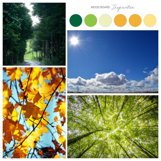
The full palette has three main colors: green, orange, and blue.
- Green: Green is the color of nature; it encourages spending time among trees and breathing in the fresh air. It invokes a sense of harmony, youthful spirit, and restoration and renewal. The Woodlands utilizes green as a primary and secondary color.
- Orange: Orange is associated with autumn, and golden oranges invoke warm fires, fallen leaves, and seasonal harvests. It’s cheerful, uplifting and vibrant. It speaks to and encourages friendliness and social interaction. The Woodlands utilizes orange as a secondary and accent color.
- Blue: Blue connects to the sky and projects dependability, loyalty, peace and relaxation, and open communication. It also links back to the primary brand color of Copley Health Systems, The Woodlands’ parent company. The Woodlands utilizes blue as an accent color.
Now, The Woodlands’ color palette has more than six colors, but there’s a specific reason for that. Those additional colors tie back into the color palette of their parent company. This allows The Woodlands to connect via color to Copley Health Systems. But day-to-day, the brand relies on just six colors, all in the green and orange range, as seen in their mood board.
Don’t Fear Neutral Colors
We all love bright, vibrant, flashy colors. But there’s something to be said for a nice neutral.
When used in branding, neutrals offer an opportunity to introduce a visual breath, a pause. Shades of neutral are also great for layering beneath text and images. So don’t shy away from including black, gray, white, cream, or beige (hey, don’t knock a good beige) in your color palette.
You can even look at a very light shade of a brighter color, think bright sunny yellow and drop it down to a creamy buttery yellow, like I did with author Lisa A. Olech’s color palette. But with it, I also included two shades of gray, which we were able to use in layering and as alternate text colors.
Convert to Other Color Modes
Once you’ve selected your colors, your next step would be to convert your colors into several color modes. In branding, there are four color modes you should be aware of:
- CMYK—CMYK stands for cyan, magenta, yellow, and black and is used in printing. So, if you send a brochure out for printing, the artwork you provide the printer needs to be in the CMYK color mode.
- RGB—RGB, or red, green, and blue, is used in digital spaces, like monitors, TVs, and film. Think of the movie industry, where many of today’s special effects are shots against a blue or green screen that can be digitally removed and replaced with a new image.
- Hex—Hex is a six-digit string of numbers and letters, preceded by the # sign, that is used in the online space. Your website is built using Hex codes. For example, black is #000000, white is #FFFFFF, and a shade of gray might be #4a4a4a.
- Pantone—Pantone, also known as PMS or Pantone Matching System, is also used in printing and refers to a specific paint code for each individual color (like the paint you buy for your home’s walls). Suppose your brand uses cold #007096 online. It would then translate to Pantone color 7705C. You can explore Pantone colors on the Pantone Connect website (use the Pantone Color Bridge Coated or Uncoated libraries).
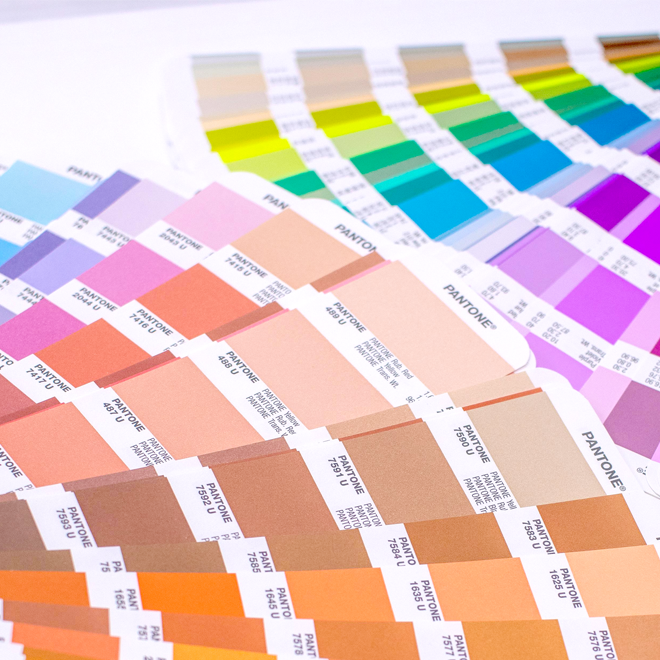
In the end you should have something like this:
- CMYK: C65, M0, Y23, K0
- RGB: R91, G199, B207
- Hex: #5BC7CF
- Pantone: 325C
Because each color mode is constructed using different methods, your brand’s colors may shift slightly from one color mode to the next. That’s why it’s best to calculate the different modes for each color ahead of time, so when you need to know what color to use when printing versus on your website, you have the answer close at hand.
Keep the Following in Mind
Here are some things to keep in mind when developing your brand’s color palette:
Check for Accessibility
An important consideration when developing a color palette, especially for your digital presence, is accessibility. This simply comes down to whether or not you’re including high-contrast and readable text to meet the Web Content Accessibility (WCAG) Guidelines for the visually impaired.
There are two critical aspects of accessibility to consider: Color Contrast and Color Blindness.
Do You Have Enough Color Contrast?
A color contrast check will help you identify which colors are visually accessible when layered on top of one another, so basically, what color text works on what color background.
Adobe Color’s Contrast Checker is a quick and easy way to test each color in your palette against the other to determine which colors you should, and more importantly should NOT, layer on top of one another.
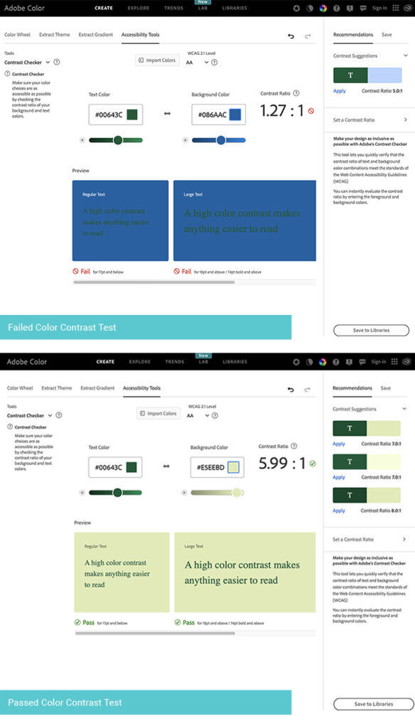
When you finalize your brand’s new color palette in your brand style guide, add a section detailing how your colors should be used. For The Woodlands, when it comes to text, we restricted the use of blue in close proximity to or on top of The Woodland’s green, as well as their secondary hues of green and orange.
Are You Color Blind Safe?
Color blindness, or Color Vision Deficiency (CVD), affects roughly 350 million people worldwide, including 1 in 12 (8%) men and 1 in 200 women (4.5%). That’s a large enough number that there’s an excellent chance that more than one person with color blindness will interact with your brand.
But the term color blindness is misleading. It’s not that all of these people can’t see any color. It’s that they can’t see as many colors as most people. There are four common types of color blindness: deuteranopia (can’t see green), protanopia (can’t see red), tritanopia (can’t see blue), and monochromacy or achromatopsia (sees only in black and white).
So before you finalize your brand’s color palette, you should do a final check to ensure it passes a color-blind safe test.
Adobe Color’s Color Blind Safe Checker allows you to input a palette of up to five colors and simulate how they’ll appear to someone who’s color blind and whether there are any potential issues that may confuse someone with color blindness.
This test isn’t about ensuring someone sees the exact color you want them to see; with a color deficiency, that’s impossible. The goal of this check is to make sure that the colors they see are different enough for them to distinguish one color from another. If they aren’t, this could lead to frustration and a potentially lost sale. Not good.
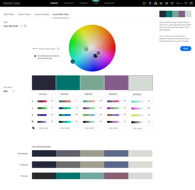
Give yourself and your color-deficient customers a leg up by checking your palette to ensure it’s color-blind safe.
Consider Where Colors Will Be Applied
Before selecting colors, consider where you’ll use your brand’s color palette. Knowing this ahead of time helps you identify any specific requirements you need to keep in mind as you build out your brand’s color story.
For example, if you’re manufacturing a product, there may be limitations on what colors can be used in the creation of your product or certain colors that simply won’t work on the material you’re using.
Consider a skincare brand. There are plenty of packaging options for skin creams, but the container you choose and the vendor you get it from may have specific requirements or restrictions on what can and can’t be done in regard to branding. Knowing these details beforehand could help you decide what colors you should or should not incorporate into your brand’s color palette.
So, outside of your website and social media profiles, where else will your branding appear? Make a list of where you plan to utilize your brand colors and identify any requirements or restrictions you must know.
Don’t Follow Trends, Think Long-Term Instead
I’m not going to lie; trends are fun. But they’re finite and exhausting to keep up with.
When it comes to branding, the last thing you want is to invest time and effort into creating a color palette that goes out of style and becomes dated because it was developed with a trend in mind, which has shifted.
Take the Pantone Color of the Year. It’s fun to see what color Pantone (the global powerhouse in all things color) chooses each year. They look at the entertainment industry, art, fashion, travel destinations, lifestyle, technology, and more to select a color representing current global lifestyle trends. But their color is, in fact, a trend and will be swapped with another color the following year. So, while it’s OK to chase trends when it comes to the color of your kitchen walls (paint is cheap), redesigning an entire brand because a trend has shifted can be extremely costly.
When considering potential colors for your brand, it’s OK to look at trends for initial inspiration, but make your final color selections based on long-term thinking rather than what’s hot in color right now.
Create Your Color Palette
Now that you know what goes into creating a brand color palette, it’s time to get building. Here’s a step-by-step roadmap to help you create a brand color palette.
Find Your Target Audience, Brand Adjectives & Create a Mood Board
- Conduct some research into your target audience to understand who they are and what challenges they face. Remember to look for both demographic and psychographic information.
- Grab my Brand Adjective swipe file, which includes 136 words that you could use to describe a brand, and identify adjectives that you associate with your brand.
- Jump on Pinterest or do a general Google image search to discover images for your mood board. Use your brand adjectives to locate 3-5 images that represent your brand’s vision. If you’re stumped on where to start, turn to nature. Mother Earth is a master at combining colors; look to her for inspiration!
- Another great place to look is Adobe Color. Using their Explore Tool, you can type in a color name or keyword, and the site will generate a palette of five colors for you. You can also hop on over to the Create tab’s Extract Theme tool, where you can drop a photo onto the site, and it will create a color palette for you based on that image.
Explore & Research Color Options
- Explore if there are colors associated with your industry.
- Review your mood board. What colors can you pull from it for your brand?
- Research the meanings associated with each color you’re considering, especially if your brand reaches customers beyond your cultural sphere or country where colors can have different meanings.
Assemble Your Color Palette
- Put together a color palette that includes 1-2 primary colors, 1-2 secondary colors, and 1-2 accent colors.
- Convert your chosen colors into the four color modes you might need, including CMYK, RGB, Hex, and Pantone. Adobe Color can be used to find Hex and RGB codes. Another good tool is ConvertaColor, which can give you Hex, RGB, and CMYK color codes. For Pantone colors, try CodeBeautify’s Hex-to-Pantone Converter.
Need help building your brand? I can help you define your color palette or develop a complete brand and logo design for your business. Let’s chat.
let's do this!
let's build your brand a personality your customers will love!
Ready to infuse your brand with personality?
© 2025 | ZIASTORIA LLC | ALL RIGHTS RESERVED
est. 2021
contact
resources
blog
client portal
portfolio
about
Sign Up
Get my best tips, tricks, and how-tos delivered right to your inbox.
Join My Newsletter
ZiaStoria partners with creative entrepreneurs and service providers to craft brand designs, websites, and email marketing programs focused on connecting with customers and growing businesses.
Beautiful & Effective Brands
Email Marketing
Brand + Web Design
Brand Design
What can I help you with?